Grocery-List-to-Cart Chrome Extension
Project Context
Meal planning usually starts with a saved recipe, from a blog, Pinterest, or even a photo snapped from a cookbook, but turning that into a grocery list often means juggling tabs, copy/pasting ingredients, or scribbling notes in your phone. Even when you know what you need, searching for each item and making sure you’re getting the right quantity, grams, ounces, packs, can feel like a hassle.
I wanted to see if a Chrome extension could reduce that friction. Unlike something like Instacart, this idea isn’t about delivery, it’s about that middle moment: from “this looks good” to “what do I need to buy?”
Goals
The goal throughout was to validate whether this concept, copying and pasting an entire grocery or recipe list and instantly building a cart could reduce friction and support how people actually plan meals.
End Users
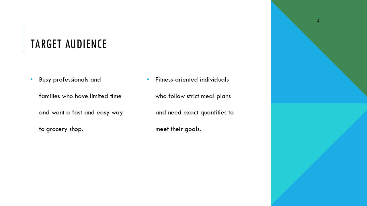
People who save online recipes and build grocery lists, often across multiple tabs, apps, or photos.
Busy home cooks, meal planners, or anyone who just wants to make dinner without juggling five tools and wants to save time.
Research Testing Plan
Methods
I started by exploring real user behaviors around grocery planning and online shopping:
Secondary research: Looked into how people plan meals, save recipes, and build shopping lists, especially across platforms like Pinterest, blogs, and recipe apps.
Survey: Ran a short survey (12 responses) to learn how people currently save recipes and shop for ingredients
Figma: Created a prototype of the grocery-list-to-cart concept
Moderated usability test: Conducted 4 moderated usability tests to see how users interacted with the flow
Synthesis in Miro: used affinity mapping to identify patterns around friction points
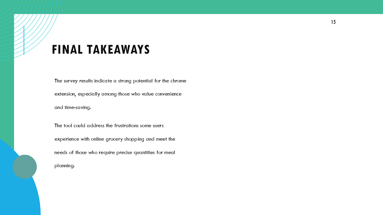
I’ve included survey findings slides with the key findings to illustrate the main themes and user needs identified through this research:
Design Solution
For the design and prototyping phase, the focus was on creating a simple interface:
Store Screen: Displays stores the user can select to shop from.
Home Screen: A clean input field for users to paste their grocery lists.
Product Matching Screen: Displays products matched to the list, with options to adjust quantities or switch brands.
Checkout Screen: A final page where users can select how they would like to checkout, in the extension or redirect to the checking out.
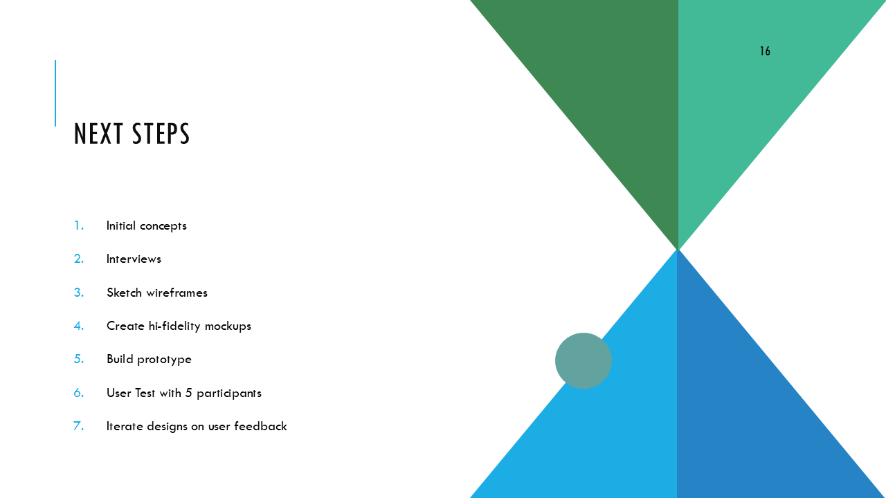
Here’s a look at the initial prototype that I tested with 5 participants:
Moderated User Testing
I interviewed 4 participants to test the Chrome extension prototype and got some great feedback on what worked and what needed tweaking.
I synthesized the findings with an affinity map, categorizing and grouping feedback.
Findings
The participants pointed out a few areas the chrome extension could improve in, like making the product selection process smoother by giving users the ability to select different varieties of a product, displaying pricing for each product and it’s variations.
Additionally, participants wanted more guidance throughout the process, such as each screen having descriptions.
With their feedback, I made adjustments to make the chrome extension more user-friendly and aligned with what users actually need. Link to prototype
Grocery-List-to-Cart Chrome Extension Prototype
Here’s a look at the second iteration of the prototype based on the findings. Click on one of the screens to view the prototype:
Conclusion
This started as a small friction point I kept running into and turned into a chance to rethink one of those everyday moments that usually gets overlooked. It’s just a concept, but it gave me space to explore how simple, thoughtful UX could make something a little easier. Even stuff like figuring out what to buy for dinner deserves better flow.


