The Home Depot Calendar Usability Test
Project Context
When scheduling an in-home consultation, users rely on calendar components within service lead forms to select a convenient day and time. However, inconsistencies across pages and layouts have made this step confusing and inefficient, contributing to increased form drop-off rates. To explore potential improvements, I led a usability testing study, supported by the UX research team, focused on three calendar component variations: two customer-facing and one associate-facing.
The goal was to evaluate which design offered the clearest and most efficient scheduling experience, while identifying usability issues that impact task completion.
My Role
Lead the project with consistent feedback and support from the Research team:
Drafted the research plan and usability test guide
Gathered and reviewed existing form and calendar research
Created participant scenarios for realistic task completion
Moderated live usability testing sessions
Synthesized participant feedback using affinity mapping in Miro
Research Testing Plan
Research Goals
Understand how participants interact with three current calendar variants
Identify pain points, friction, and usability issues in the calendar step
Determine which variant performs best in terms of usability, engagement, and task success
Methodology
Moderated usability testing with 19 participants (10 desktop, 9 mobile)
Participants completed a task to schedule an in-home consultation via embedded lead forms
Counterbalancing was used to minimize order bias
Sessions conducted via UserTesting.com, 30 minutes each
Participants
All participants completed the tasks as expected. Feedback patterns were consistent across both desktop and mobile users.
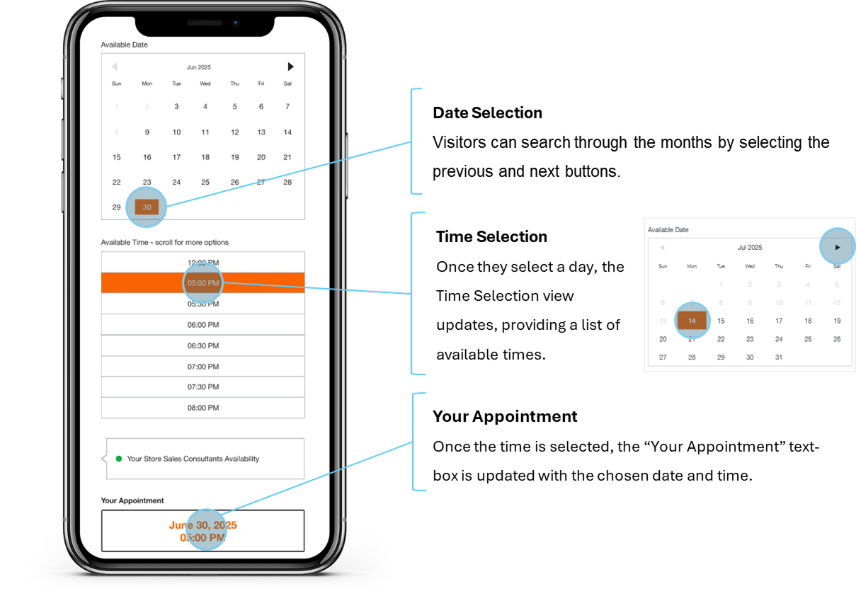
Calendar A

Calendar B
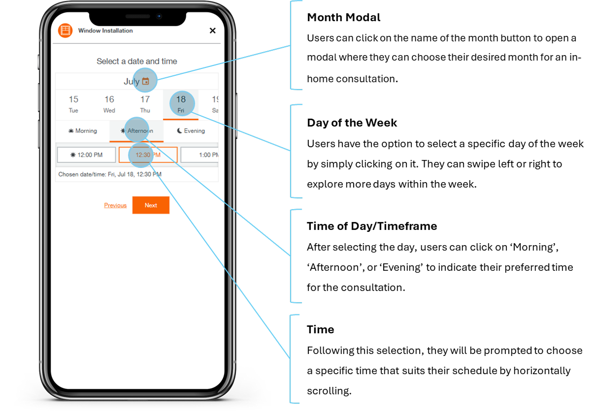
Calendar C
Tools and Platforms
The project leveraged several key tools and platforms:
Prototypes: I created the Calendar A prototypes utilizing Figma for desktop and mobile views, representing a hybrid of the current HVAC Installation service page and the associate facing calendar step design.
Page links for Calendar B & Calendar C
Usertesting.com: Used to conduct moderated tests with participants, providing a platform for capturing real-time feedback on both form layouts.
Miro: Used to create affinity maps, organizing participant feedback into clear, actionable insights.
Presentation Tools: Utilized to create a deck summarizing the research findings.
What We Learned in Testing
After testing both prototypes, we synthesized participant feedback using affinity mapping and identified key insights:
Calendar A (Window: Associate-Facing Form Hybrid)
What Worked Well:
Participants found the calendar easy to use, requiring minimal clicks
One-page form layout made the experience quick and simple
“Your appointment” confirmation before submission reassured users
“It was seamless… very simple, short, sweet and to the point.” – Participant 1
Pain Points:
Tooltip “Your Store Consultant’s Availability” caused confusion
“Is this important? Should I be paying attention?” – Participant 9
Calendar B (HVAC: Multi-Step Form)
What Worked Well:
Calendar was clear; unavailable dates and times were visually distinct
Pain Points:
Participants disliked having date and time split into different views
Form placement on hero banner felt too small and hard to focus on
Notes section lacked meaningful placeholder guidance
“I don't like how small it is... I’d prefer it fill the entire page.” – Participant 17
Calendar C (Window: Multi-Step Form)
What Worked Well:
Users liked the flexibility of choosing month, day, and time
Confirmation page syncing with calendar apps (Google, Outlook, Apple) was appreciated
Pain Points:
“Time of Day” felt like an unnecessary and vague step
Excessive horizontal scrolling made time selection frustrating
Splitting contact information into two steps created confusion
“I don't love time of day... I like to know exactly when they’re showing up.” – Participant 11
Actionable Insights
Key Takeaways:
14 out of 19 participants preferred Calendar A for its clarity, speed, and simplicity
The one-page flow consistently led to better usability and higher participant satisfaction
Recommendations:
Roll out Calendar A across service pages for a consistent user experience
Remove unclear tooltips like “Your Store Consultant’s Availability”
Add calendar sync functionality to all confirmation pages
Consider transitioning from embedded hero banner forms to i-frame forms for improved visibility
Next Steps:
Launch A/B test of Calendar A on HVAC and Window Installation pages
Monitor test performance for three weeks before scaling