The Home Depot: Self-Checkout Receipt Selection Concept
Project Context
While using the self-checkout kiosk at my local Home Depot, I noticed the receipt screen offered two options: ‘Email and Print” or “Print Receipt”. Both printed paper. There was no way to take a receipt digitally and skip the printout, and the two labels were close enough that the difference wasn’t obvious at a glance.
Nobody asked me to look at this, but it’s a low-attention screen with a lot of volume behind it, and a straightforward place to make the sustainable choice the easy one.
Goal
Give customers a way to take their receipt digitally without printing, and make that the default path without removing the option to print.
End Users
Home Depot customers using self-checkout kiosks, particularly those open to digital receipts.
Research Focus
How can small changes to a confirmation screen guide customers toward digital receipts without adding friction or confusion?
Methods
On-site observation of the current kiosk flow
Comparative review of digital-first receipt flows at other retailers
Secondary research on defaults and sustainable design patterns
What I observed
The confirmation screen offered “Email and Print” or “Print Receipt”. Both printed paper, so a customer who wanted a digital-only receipt had no path to one. The labels were also similar enough to require a second read to tell them apart, which meant the screen asked for attention at the exact point where people are trying to finish and leave.
CVS handles the same moment differently, digital receipts are the default, and paper prints only if you ask for it.
What Informed the Design
Simplifying choices lowers the barrier to sustainable action (source). Defaults quietly shape behavior without removing control, and showing people the impact of a choice increases follow-through (source).
Wireframes
I started with low-fidelity wireframes in Figma to work out how the options would sit on the confirmation screen, in both vertical and horizontal kiosk layouts.

In-store self-checkout kiosk: Confirmation screen vertical wireframe (Figma). This is the current confirmation screen layout with the addition of SMS as a receipt option and the carbon footprint saved message.
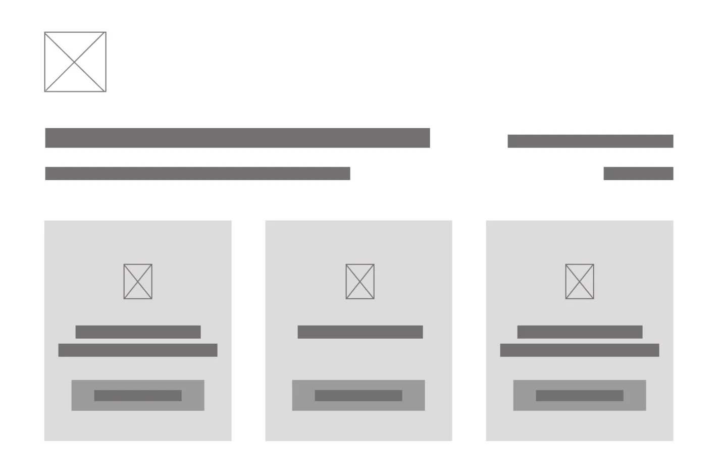
In-store self-checkout kiosk: Confirmation screen horizontal wireframe (Figma).
Design Solution
The revised confirmation screen made three changes:
Simplified the options to email, SMS, or print, replacing the combined choices.
Added a “go paperless” message
Set digital as the default, keeping print available but no longer as the path of least resistance.
Mockups
The mockups carried the wireframe structure into a finished screen:
Clean, accessible typography so the options are legible at kiosk distance.
I considered showing carbon savings or tree equivalents, but neither holds up at single-transaction scale. One receipt is a rounding error against a tree, and grams of CO2 don’t mean much to someone trying to finish and leave. Sheets of paper is the only unit that’s literally true for one purchase and understandable at a glance.
Clear CTAs for each option, with the digital receipt pre-selected.
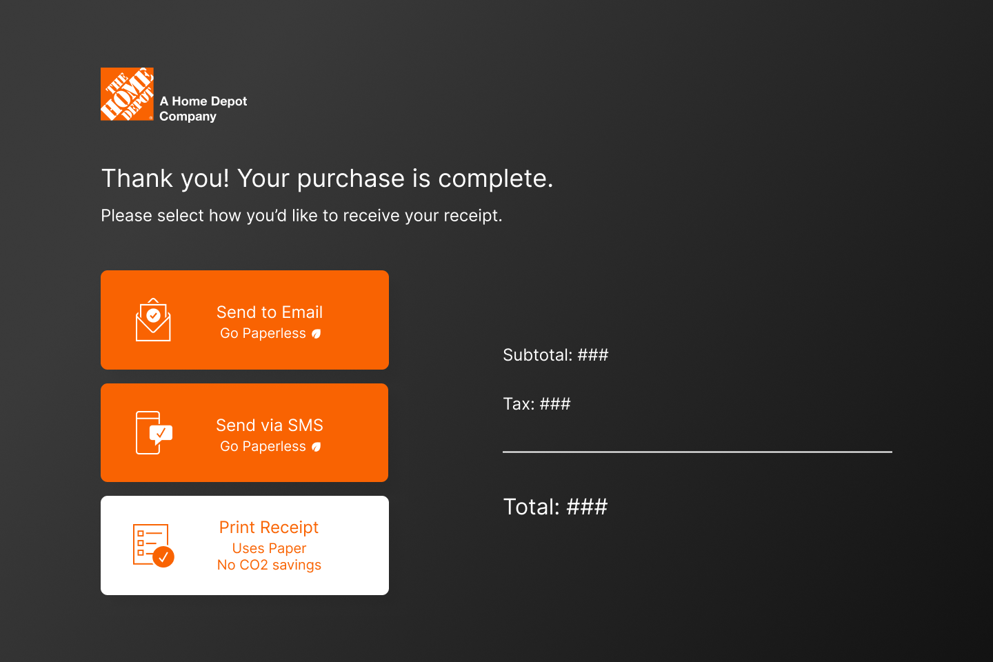
In-store self-checkout kiosk: confirmation screen vertical mockup (Figma). This is the current confirmation screen layout with the addition of SMS as a receipt option and the carbon footprint saved message.
In-store self-checkout kiosk: confirmation screen horizontal mockup (Figma).
Conclusion
This was a small, focused change rather than a full redesign, but it’s a good example of how much interface micro-decisions carry. I shared the recommendations with the POS team and got positive feedback, though the project was paused before it moved forward.