Soffe E-commerce Redesign
Project Objective
When COVID-19 escalated the shift to e-commerce, Delta Apparel decided to optimize and redesign its websites, including Soffe. I collaborated with a cross-functional team, including SEO, email marketing, a product manager, and developers, to create dynamic landing pages for product, category, and content sections, aimed at improving site navigation and enhancing user shopping experience.
My role
Worked within the e-commerce team to ensure a functional and cohesive design.
Designed wireframes and mockups to increase customer engagement, working across Adobe Creative Cloud and Hotjar.
Collaborate with e-commerce and development teams to implement wireframes and mockups on the live Soffe site.
Prioritized accessibility throughout the design by incorporating WCAG-compliant color contrast and ensured clear, intuitive labeling.
To view the mockups, please click on the images below:

Account Dashboard Final Mockup
Scope & Constraints
Pages had to be fully responsive across desktop, tablet, and mobile
The design had to adhere to the existing brand style guide
The CMS’s architecture dictated how category pages could be structured, so layouts were designed around its existing page hierarchy
Size taxonomy was fixed by existing product data, so the filter design had to work with those groupings rather than reorganize them
Development was handled by an external team, so design intent had to be fully specified in documentation.
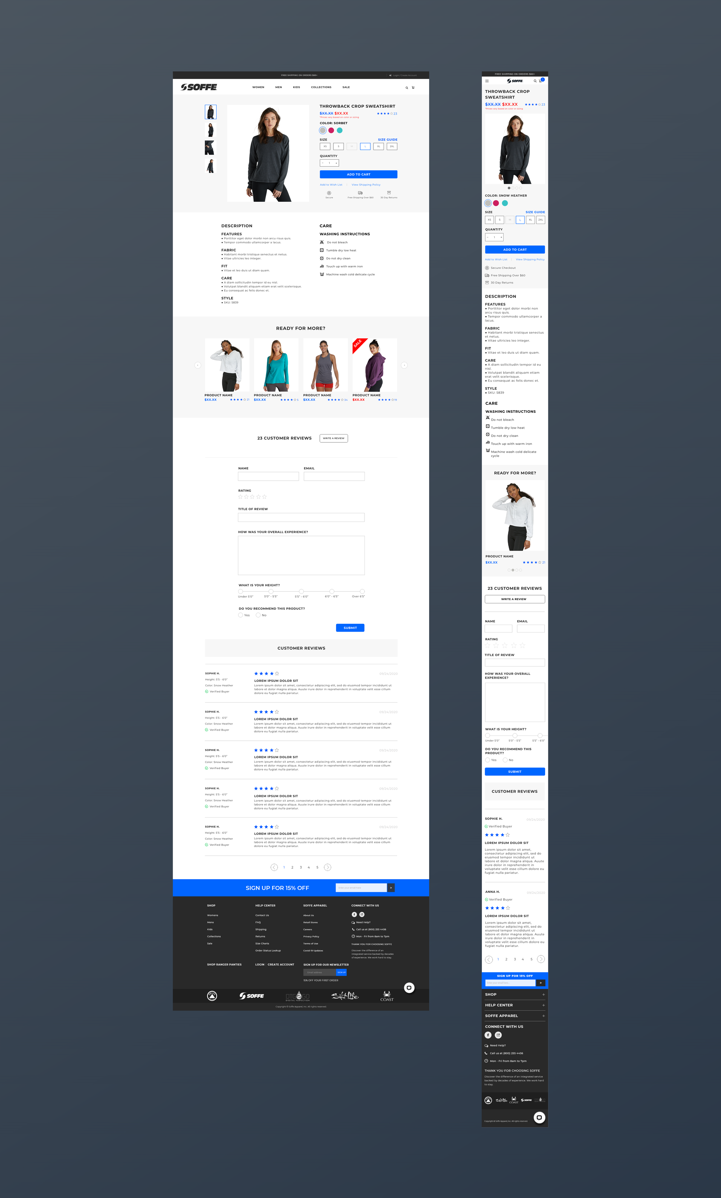
Product Description Pages Mockup
The Design Solution
The existing site was difficult to navigate, and the goal was to highlight Soffe’s products while improving the shopping experience. I began with a site audit analyzing user interactions, browse depth, page views per session, and demographics, to better understand the target audience, then translated those findings into wireframes and high-fidelity mockups.
For category pages, the size taxonomy was inherited. Soffe’s catalog spans infant through adult plus tall variants, and those groupings were fixed by the existing product data. What I changed was the interface around them, using collapsible filter groups so users could open only the categories they needed rather than facing the full set at once. On mobile, the main navigation collapsed into a hamburger accordion, letting users expand a single category instead of scrolling the full menu. I also designed the product cards themselves, how products appeared in the grid, how color variants surfaced with a “+ More” indicator, how sale states were flagged, and the supporting messaging, so users could evaluate options without opening each product. Below the grid, I placed the category’s descriptive copy, keeping products first for shoppers while retaining the content for search.
For product pages, I designed the layout to support a purchase decision without requiring users to leave the page. Out-of-stock sizes were greyed out rather than removed, so users could tell a size existed but was temporarily unavailable, and a note about price variation by color and size sat directly beneath the price, where the question would arise. Trust signals, secure checkout, free shipping over $60, and 30-day returns, were placed immediately below “Add to Cart” rather than in the footer. On desktop, description and care instructions ran side by side. On mobile they stacked with description first, since care information matters mainly after purchase. The vertical thumbnail strip became a swipe carousel with position indicators on mobile, replacing the pattern rather than compressing it.
For the account experience, I designed the login page to give account creation equal weight alongside returning-user login, presenting concrete benefits, faster checkout, 30-day returns, and order management, rather than a generic prompt to register. On the account dashboard, recent order activity leads the page, since order status is the most common reason customers open their account. On mobile, both pages reflow to prioritize the primary task, and the order table reduces to its essential columns.
Across desktop and mobile I worked from a 12-column and 6-column grid respectively, keeping structure consistent as page types varied. Throughout, I checked layouts against WCAG 2 contrast standards, and used clear, intuitive labeling.
All design decisions were developed iteratively with feedback from the product manager, e-commerce team, and development team.

Category Page Wireframe
The Tools & Platforms
I put together a range of deliverables for the redesign, including:
Deliverables
Wireframes defining structure and functionality for desktop and mobile
High-fidelity mockups with typography, color, and responsive layouts
Technical specification document detailing functionality and image requirements for developers, aligned with CMS limitations
UI testing support during implementation
Functional specification document with annotated mockups, defining interaction states, functionality, and image requirements for the external development team, aligned with CMS limitations
I also supported the e-commerce and development teams with UI testing, verifying that the final site met usability standards, visual design goals, and WCAG 2 accessibility compliance.
Tools & Platforms
Design: Adobe Photoshop, Adobe XD
Analytics: Hotjar
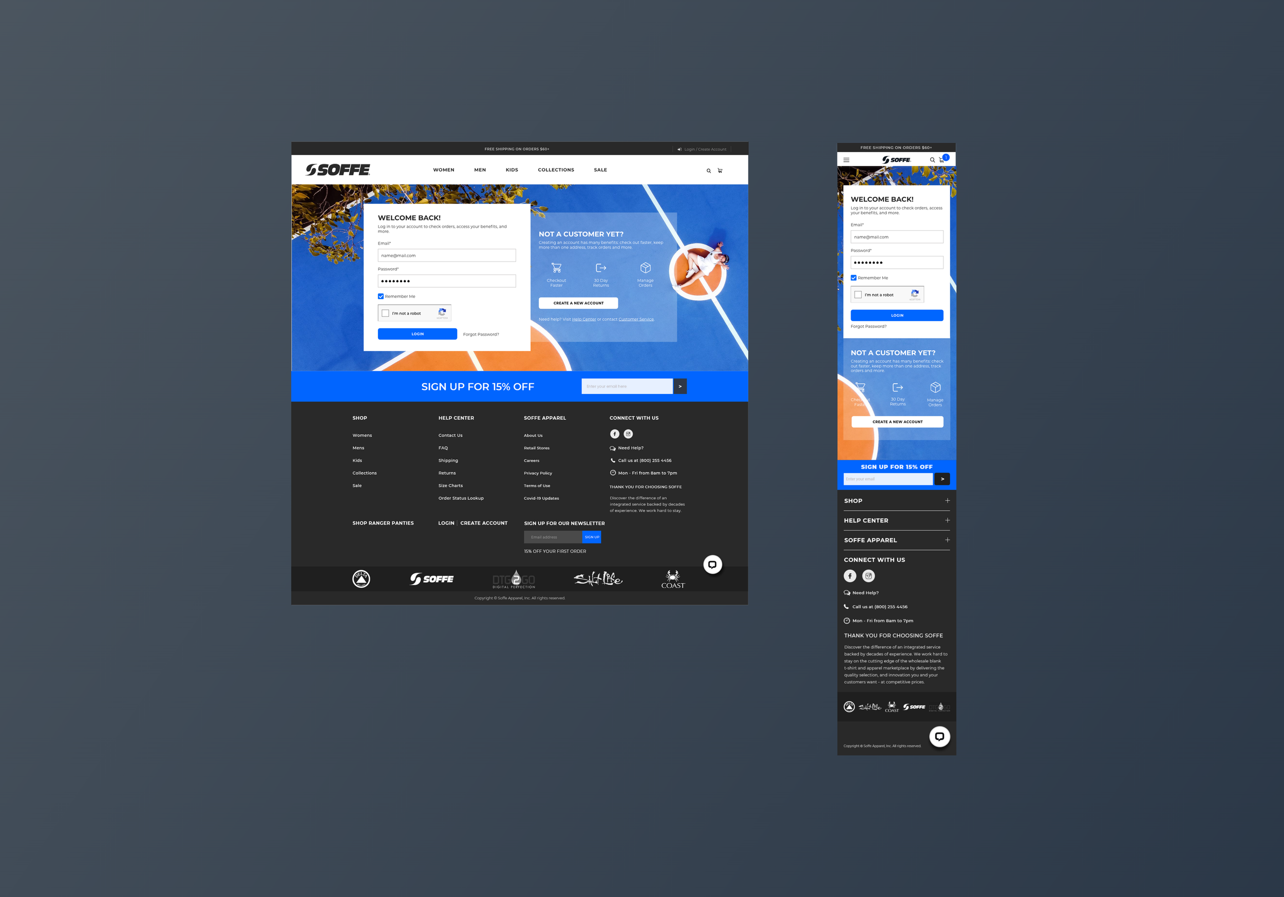
Login Page Mockup
Conclusion
The redesign gave Soffe a consistent page system across category, product, and account experiences, one that worked around the constraints of the existing CMS and product data rather than requiring either to change. Supporting UI testing alongside the product manager and development team gave me a clearer view of how design decisions survive implementation, and reinforced how much responsive, accessible design depends on that handoff.